How to Create an Effective User Journey for Beauty Recommendations
To use the benefits of a product finder or product recommendation quiz to the fullest, you need to create a great user journey. Help customers discover Skin Match Technology fast and easily for optimal conversion.
The fact is, if users take a beauty quiz they are 10x more likely to purchase and you do not want to lose out on this conversion. So your goal should be to guide as many users through this channel as possible.
This is not always an easy task, especially if you do not have your own UX Team or Conversion Manager. The following checklist and 5 tips will guide you in the right direction. In this post, we'll look at some great call-to-action examples that our clients use effectively.

Why do I need a call-to-action?
Your call-to-action tells visitors what to do, where they should click, and what they should buy. It’s what lights the path to your checkout and turns a new visitor into a customer as quickly as possible.
Market research shows that a person needs to know your brand, your reputation, and your product before they’re willing to make a purchase. So if your goal is to create an efficient selling engine generating the most revenue at the least cost, strategic CTAs are critical to its success.
It has shown that the right user journey through our product finders can increase the overall conversion rate by +135%!
Here are 5 effective tips to increase quiz completions
Tip 1: Consider the funnel stage
Funnel stages refer to the customers’ mindset on their path to purchase. It represents the marketing strategy used to turn prospects into paying customers. The goal is to map out the route to conversion.
At a high level, a funnel consists of three parts:
Top of the funnel: awareness stage where people learn about your brand - this usually happens outside of your website. For example on Instagram, blog articles, or advertising. This is a great place to educate your potential customers about your products, the benefits they provide, and what your brand stands for. People love taking quizzes and learning more about what suits them best in this very explorative phase of getting to know your brand.
Middle of the funnel: interest and decision stage where people are looking for specific benefits on your website - they discover your products and want to know more about them. Like how are they produced, what ingredients are in them, do you have the right color match and what benefits will these products bring to a daily skincare routine. This is a moment to help them out with a quick and simple product finder that allows them to see personalized results in seconds.
Bottom of the funnel: action stage where people are ready to buy. Here the work is done and all you need to do is have a simple “add-to-cart” for the product they want.
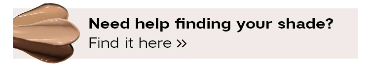
2) Use visually appealing buttons with simple copy
It takes 50 milliseconds for a visitor to form an opinion about your website or ads, so it’s vital that you make it eye-catching and simple. One of the ways you can do this is by using buttons to direct visitors’ attention to the action you want them to take.
You can cater your button copy to the market you’re selling. If you’re selling something like makeup, try changing the copy on your buy button to “Match my Skin” and see if that helps with conversions!
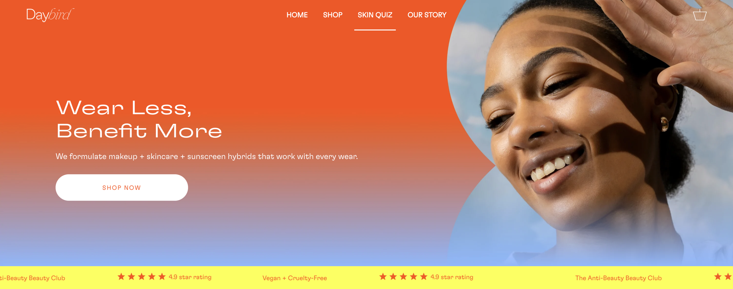
3) Use captivating hero images
The main, featured images on the homepage of a website can be used to highlight a product or collection. In other words, they can be a massive call to action. Be sure to have your hero image link to the Shop and Product Finder to get visitors in the right funnel straight away. Either they are here to replenish on products they know and love or discover new products.
This client below does a great job of featuring the skin analysis with a link to our Skin Care Finder on its homepage. It uses great images that make you want to find out more about the product. Simple and easy and sure to turn into sales.

4) Keep it “above the fold”
The phrase “above the fold” comes from the newspaper industry, as the most important stories appear on the top half of a paper’s front page—the half you see when it’s on the newsstand or in a box. Below the “fold” of a storefront is the area of a website you can’t see until scrolling down. Any content above the fold is what visitors immediately see upon entering your online store.
If you can grab a visitor's attention above the fold to take the beauty quiz, chances are they’ll continue to click and complete it.

5) Add it to your main Navigation
When people are looking for advice they always checkout the main navigation for what you have to offer. Make it easy for them to find it by linking it directly. Include Skin Match as a Main Navigation Point in your Header and add teasers in your Sub-Navigation